One of the biggest questions that startups deal with is how to improve their conversion rates. Let’s face it. Driving customers down the funnel isn’t easy, and closing that deal takes a lot of work.
Here are some important areas that you should work on to eliminate major roadblocks that are hindering your users from moving down the funnel.

1: Imitating the Big Boys (let’s say Amazon)
One of the easier things to do when setting up a website is to copy someone else’s work. It’s understandable since things are working out for a specific company, people will start copying the layout and flow of their website.
For example, a lot of people think that by simply copying the layout and design of Amazon’s site, they can duplicate the flow, experience and conversion easily. Amazon does takes it conversion process easily and have invested time money to improve conversion.
But you also have to be aware of the following:
- Brand Recognition – Amazon has been around for so long that they have become THE place to shop for items. People know about them, as they are by now a household name. And when people come into their site, they expect superb customer service.
- Multiple Traffic Sources – Companies like Amazon have built a reputable presence online – and with that comes multiple sources of traffic. When people use search engines like Google to search for a product, most will see products from Amazon on top of the list. And what this means is that the conversion process has already started (even before clicking on the link)
- Duplicating Site Errors – Successful companies and their websites are not perfect. So if you intend to copy their site (and everything about their system), you also copy their mistakes in the process. Having the same hosting and cloud provider, can cause the same problems if it goes down. So blindly following and copying sites does have it’s downsides too!
- Different Brand Strategy – Other companies have different objectives, strategies, affiliations, partnerships and competition. You have to be aware that copying can also cause confusion to customers.
With those four items being discussed, it’s still a good tactic to observe and get inspiration from others. But before doing anything – be sure to check your own objectives, goals and plans for your site. The best advice is to Always Be Testing.

2. Multiple Text Fields
There’s a lot of things that has been advised to website owners about limiting additional navigation, multiple call to actions texts and hovering distraction to improve conversion rates. But another new roadblock is starting to appear in several websites. In the quest of learning more about the customer, multiple text/form fields are showing up on Landing Pages and Purchase
forms.
Limiting the number of text fields is important.
Why? Because most purchases and transactions nowadays are being done using smartphones and tablets. Filling up forms and tapping the screen multiple times just detracts the fun out of buying the product.
There’s really one rule for this: Keep It Simple. Try to minimise the number of fields that your customer has to go through.

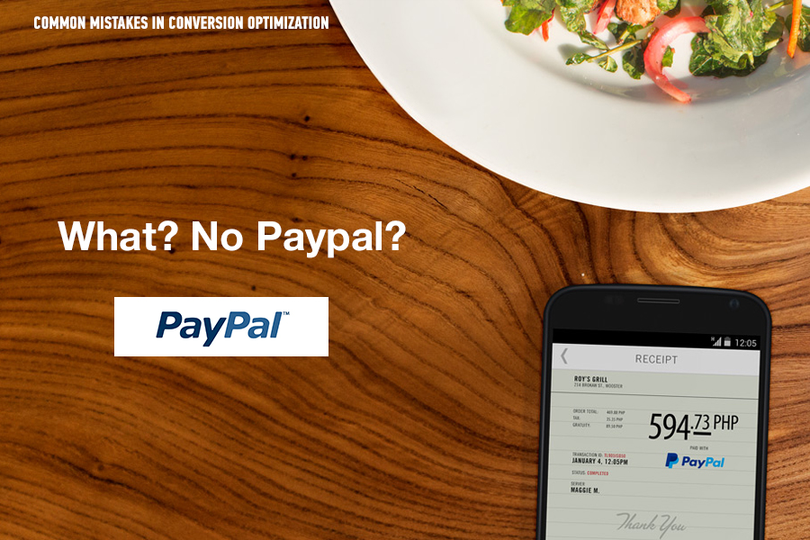
3. What? No Paypal?
This has got to be a totally shocker for some people. But yes. there are still some sites that do not have Paypal.
Not using Paypal as one of the payment options can cost your site orders. (I for one have skipped several purchases due to this) Some people would much rather pay other options, and are not willing to share their credit card information.
Did you know that 67% of shopping carts are abandoned during checkouts? Though there are several reasons for this, but having a complete payment option helps conversions.

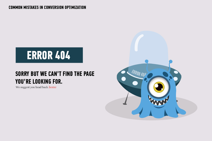
4. Ready to buy… Wait this link doesn’t work!
I’m sure this has happened to a lot of people by now. You’re looking at some items hoping to buy something online, you click the image and it goes straight to this page – Error 404 – Page not Found.
Frustrating isn’t it.
Though this may be a simple technical glitch, but if people are clicking on the link, going to an error page- chances are – they’er going to your competitor’s site. You just lost a customer, buddy!
Make sure that all links are working on your site. My suggestion is to be view the website from your customer’s perspective. Be objective – and this will improve your conversion rates.
So we’ve discussed some points on how to improve conversion rates? Any other ideas? We’d love to hear about it!
